George Lois's Esquire covers

George Lois on the first cover he art directed for Esquire:

Hayes mentioned that we were going to have a spread of Floyd Patterson, the boxing champion of the world, and Sonny Liston, the challenger, and Patterson was an 8–1 favorite. I knew right away what I was going to do, because I knew that Liston was going to kill him. So I called the photographer, and I said, “We’re going to get a guy with the same body as Patterson, we’re going to lay him flat on the ring, and we’re going to show him killed, knocked out by Liston. Leave him for dead.” I wanted to show a metaphor for boxing – if you’re a loser, you’re left for dead, which is also a metaphor for life. So we get the shot and I sent it to Hayes.

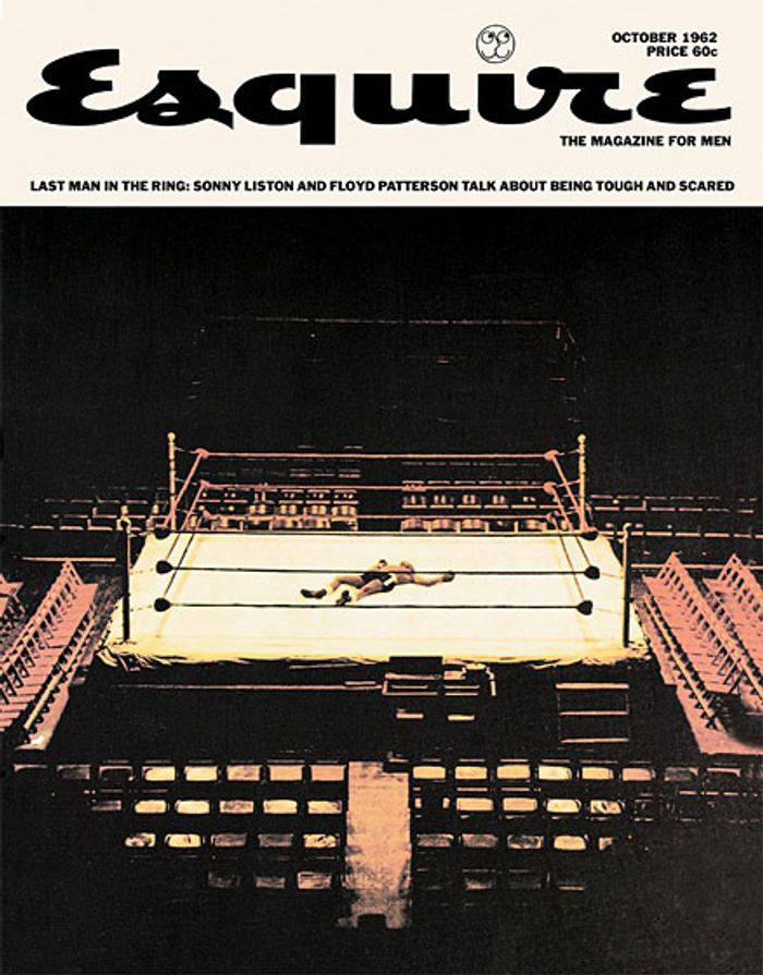
“George, I never saw a cover like this in my life! You’re calling the fight – suppose you’re wrong? Everybody says you’re wrong.” I told him we had a 50/50 chance of it working, but if it does, it shows we have balls. It hit the newsstand a week before the fight, and it was roundly laughed at in the sports crowd. But a week later, of course Liston kills Patterson, just like I thought. And Esquire got tons of publicity and the best sales since the start of the magazine. And Harold said to me, “You gotta keep doing my covers.”

He went on to create 92 iconic covers during the 1960s that were exhibited at MoMA and added to the permanent collection. Unfortunately only five of the covers have their image rights cleared to display online. Not many people realize that even if a work is “owned” by the museum, having the right to display it online is another matter. This is an issue the Brooklyn Museum has addressed nicely on their blog. This is why photography is usually not allowed in museums, except within the older permanent collections.

Link via Jason Kottke

A brief homage to Franklin Gothic

Franklin Gothic is the basis of MoMA’s typographic identity. August Hefner found some examples of Franklin Gothic being used at the museum dating back to the 1930s. One of the signs reads:

The public is urgently requested to visit the Galleries in the morning, from 10 to 12 and evening from 8 to 10 in order to avoid congesting the elevator service. If this request is complied with, it will not be necessary to charge admission.

I didn’t realize that the museum’s adaptation of the typeface, MoMA Gothic, was created by the same type designer as the original.

Link

Our game-permeated future

Jesse Schell is a professor at CMU who gave a presentation recently on games and their relationship to culture. The tone changes a lot toward the end of the presentation with a surprise (to me) ending. I disagree with his conclusion, but I’ll leave that for a future post.

Link (See also)

MoMA interview with Yugo Nakamura

I was happily surprised to see this interview by Shannon Darrough, who I work with on MoMA.org.

Nakamura’s MONO*crafts 2.0 was also a big inspiration for me when I was first getting into web design. It feels dated now, of course, but I remember feeling thrilled to see this bold assertion in the navigation: interfaces can be impractical, users can be invited to explore and play.

Link

The Casio F91w digital watch

There is a specific model of Casio digital watches that supposedly has desirable qualities for bomb detonation. Anonymous LiveJournal user tongodeon has been following this story for over a year:

A while ago I made a big deal out of the Guantanamo detainees accused of owning Casio F91w wristwatches. In my letter to then-candidate Barack Obama I wrote that “Some have done far worse than wear a cheap digital watch. Some have done little else. In all cases the watches that they were wearing appear to have had nothing to do with anything. The tenuous link between this watch and terrorism is being used as an excuse to detain the innocent alongside the guilty; an excuse for the inexcusable.”

Of the 28 prisoners accused of owning Casio F91w wristwatches, 21 have been released, mostly under the Bush Administration. Prisoner #33, Mohammed Ahmad Said Al Edah, won his habeas petition but it doesn’t say whether he’s actually either been cleared to be released or actually been released. No info on the remaining six.

Link

International Year of Astronomy posters

Riffing off another of Jason Kottke’s linkages, these minimalist posters are at once timeless and retro looking.

Initially designed as self-promotional pieces, the posters eventually caught the eye of the IYA 09 organisation which approached him a few months ago to see if they could use them in their own promotional work.

International Year of Astronomy posters

Link