Canada 150

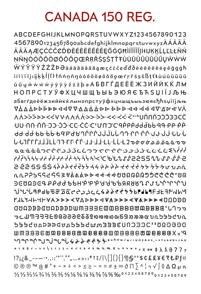
In 2017 Canada will celebrate 150 years since its confederation. The Canadian government commissioned type designer Raymond Larabie to adapt Mesmerize into an official national typeface.

The typeface includes all Latin characters and accents, common Cyrillic characters, and syllabic and diacritical elements contained in Canada’s Aboriginal languages. The typeface is provided in two weights: light and regular.

Canada is home to over 60 aboriginal languages
Canada is home to [over 60 aboriginal languages](http://www12.statcan.gc.ca/census-recensement/2011/as-sa/98-314-x/98-314-x2011003_3-eng.cfm)

Oddly, if you want to use the official font you must apply for permission.

See also: Clearview, the federally-approved highway typeface

Link

A brief homage to Franklin Gothic

Franklin Gothic is the basis of MoMA’s typographic identity. August Hefner found some examples of Franklin Gothic being used at the museum dating back to the 1930s. One of the signs reads:

The public is urgently requested to visit the Galleries in the morning, from 10 to 12 and evening from 8 to 10 in order to avoid congesting the elevator service. If this request is complied with, it will not be necessary to charge admission.

I didn’t realize that the museum’s adaptation of the typeface, MoMA Gothic, was created by the same type designer as the original.

Link