Escape from Mercator

I’ve been working with online maps since before the first Google Maps API was released, and I haven’t seen anything quite like this before. Kudos to Mapzen and Peter Richardson.

Inception bendy map!

Web Mercator has been the default projection for the web since Google Maps first popularized it in 2005.

Though it is ubiquitous online (and historically useful to navigators), Mercator doesn’t get much love from the modern cartographer. And in general, Mercators are unsuited for cases when you want to compare the size or shape of anything that isn’t near the equator. So while Web Mercator is useful, we’ve been using Tangram to explore other options.

Tangram draws maps in real-time in your web browser, using a hotline to your graphics card called OpenGL.

Link

Mapping Climate Change

Here’s a map created by Stamen comparing two different scenarios of climate change, depending on how much carbon we manage to cut.

Maps show sea levels that could lock in this century, and occur as early as 2200. Which level depends on how much we pollute.

See also: a WIRED magazine article about the map.

Link

Which U.S. State Performs Best in the New Yorker Caption Contest?

As you might expect, New York and California have the highest number of total Cartoon Caption Contest wins with 87 and 76, respectively. But they also have the most losing entries.

The United States of the New Yorker Caption Contest: Wins Per 10 Thousand Submissions

This map shows that Alaska is actually the most successful state in terms of wins per ten thousand submissions! Though Alaska has only won the contest twice, the fact that it had a mere 2,102 documented contest entries renders its rate of approximately 9.5 wins per ten thousand submissions the highest in the country. Mississippi, another state not commonly associated with the New Yorker crowd, comes in at a close second, with 8.14 wins per ten thousand submissions.

Link via Caitlin

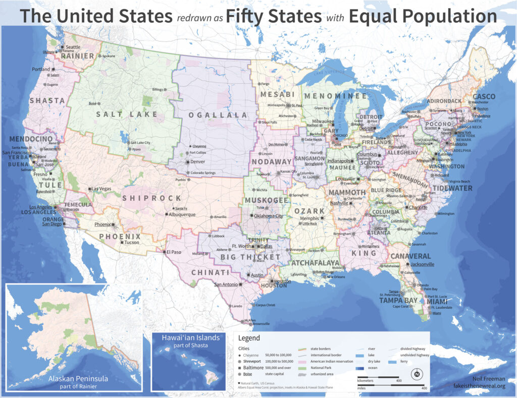
Neil Freeman interviewed about his Electoral College Reform map

You may have seen Neil’s map before, where each of the US’s 50 states are redrawn to balance for population. It’s nice to see his project’s motivating ideas laid out like they are in this Paris Review interview:

I think that the biggest cultural change would be with the profusion of city-states. Many states overrepresent rural areas when it comes to divvying up funding for infrastructure projects and other spending. The alignment of metro areas and states would mean that decision-making power in land use and transportation would shift away from rural areas, which would probably mean less sprawl and more livable cities.

electoral10-1100

See also: Neil’s 50 states and 50 metros

The fifty largest metro areas, disaggregated from their states. Each has been scaled and sorted according to population.

How to split up the U.S. according to Facebook profiles

Pete Warden analyzed 210 million Facebook profiles and identified 7 distinct geographic clusters.

Some of these clusters are intuitive, like the old south, but there’s some surprises too, like Missouri, Louisiana and Arkansas having closer ties to Texas than Georgia.

Link (See also)